Sabrett Hot Dogs Logo / Branding / Identity / Motion Design
I was asked to redesign a menu for one of my design classes at Fullerton State and I couldn’t think of a more “eye-sore” menu than the one’s on the hot dog carts in New York City.
Problem
I was tasked with redesigning a menu. As mentioned before, the menu seen to the left, is an eye sore. ‘Hot Dog’ is on the menu three times (not to mention seeing it again on the umbrella and on the sides), the images are out dated, and the text and overall color dont cut it. There are also no prices.
My MAIN concern was this: YES the cart hurts to look at but somehow it is full of spirit, color, and life. It screams New York and it was going to be tough trying to redesign it without it feeling like I’m gentrifying a main feature of the city.
Process
I chose stronger hues for the yellow and blue that partner with each other smoothly. I chose the Atlive Ultra type and decided to stick with an all caps style as it helped display boldness of the brand. I also decided to keep the extrusion effect on the logo.
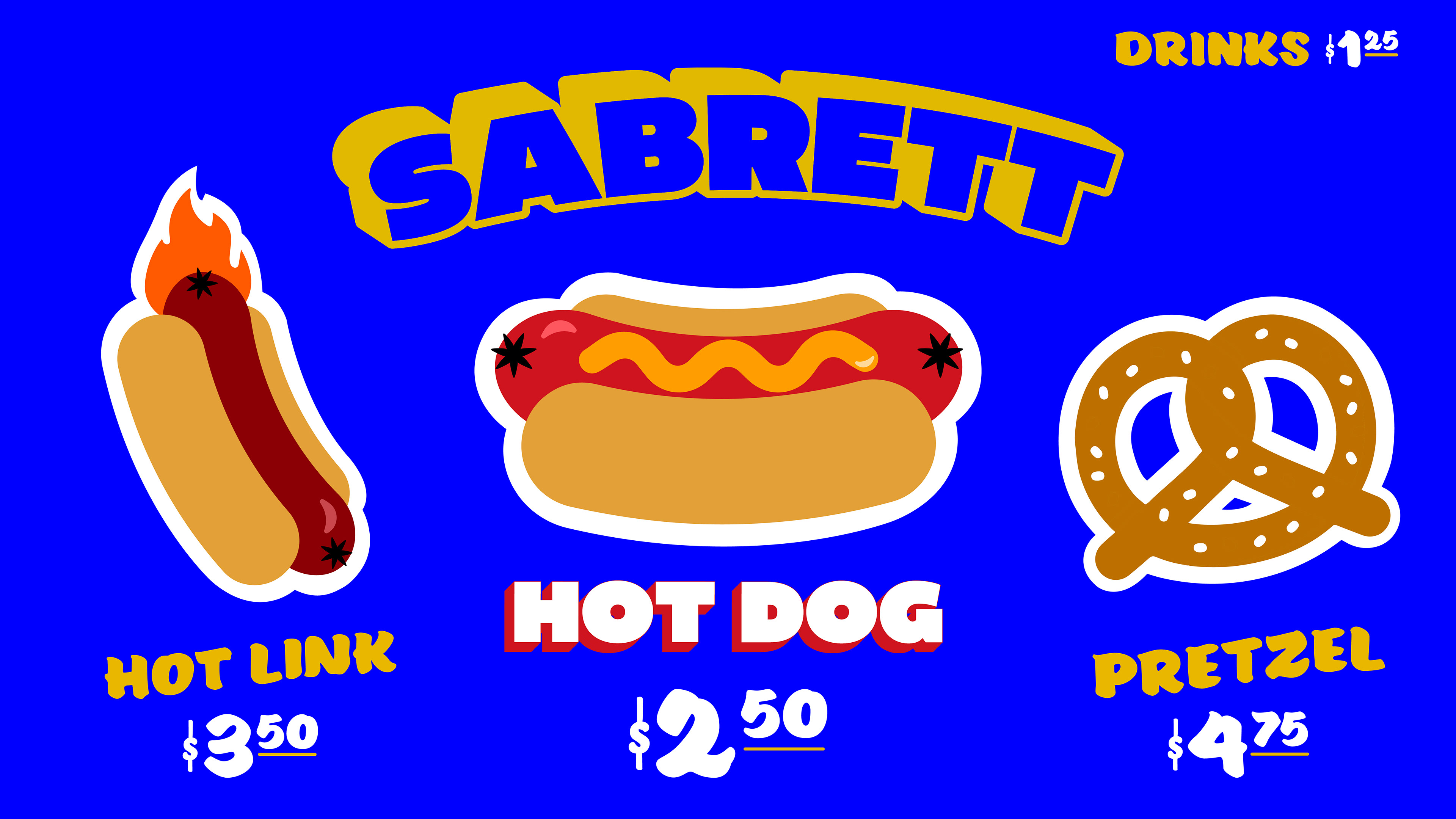
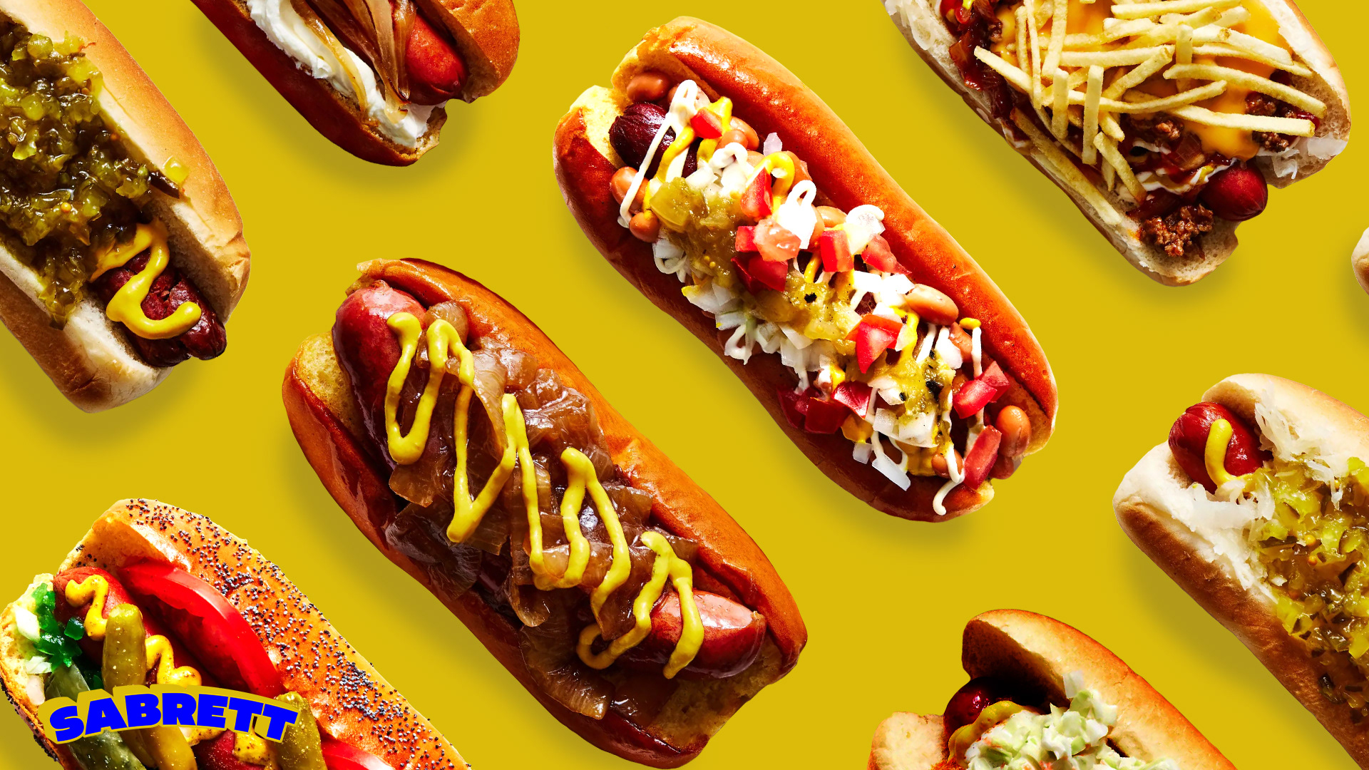
I went through many phases of the menu but decided to stick with a look that paralleled the vibes of a bodega which brought that classic hand painted text look to the menu. I also felt like sticking with illustrations of the menu items as they felt fun and didn’t look as serious with images of the hot dogs. I also decided to add prices along the way to add depth to the menu (also hot dog carts never have prices on them).
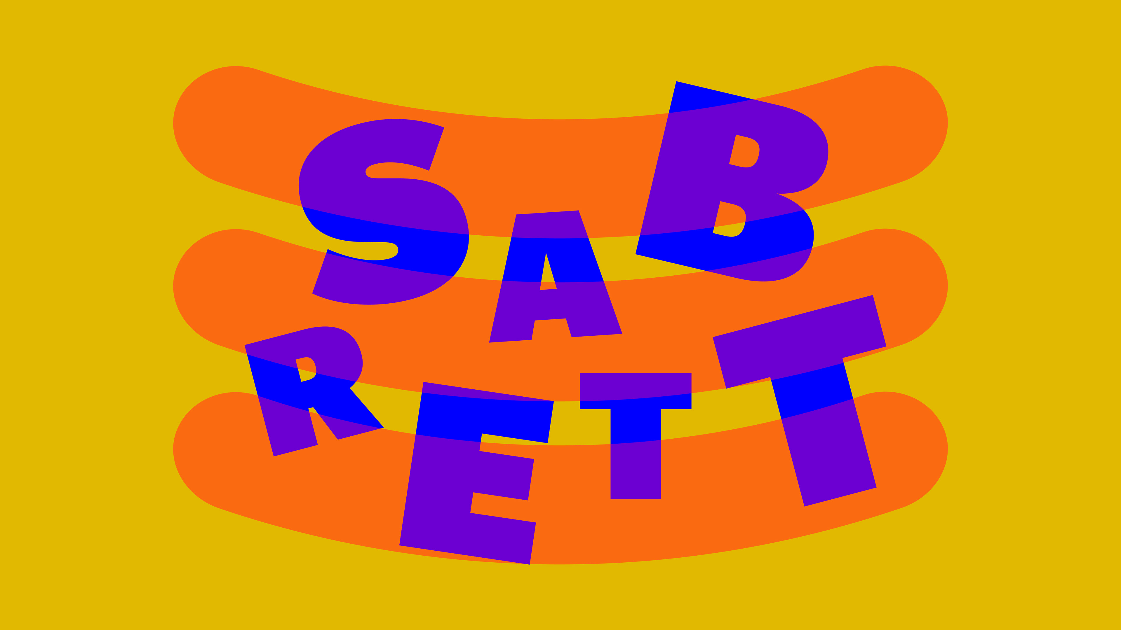
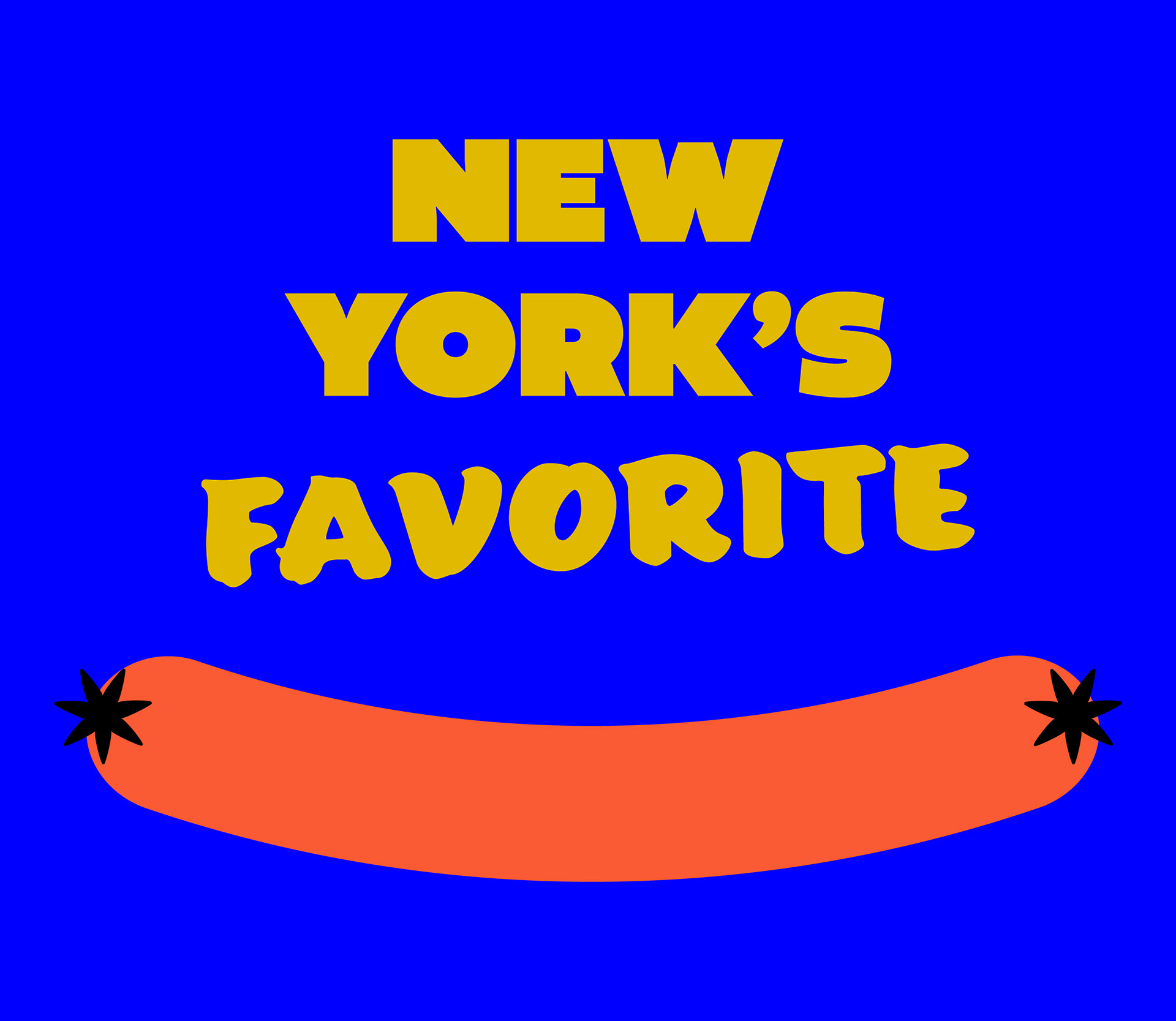
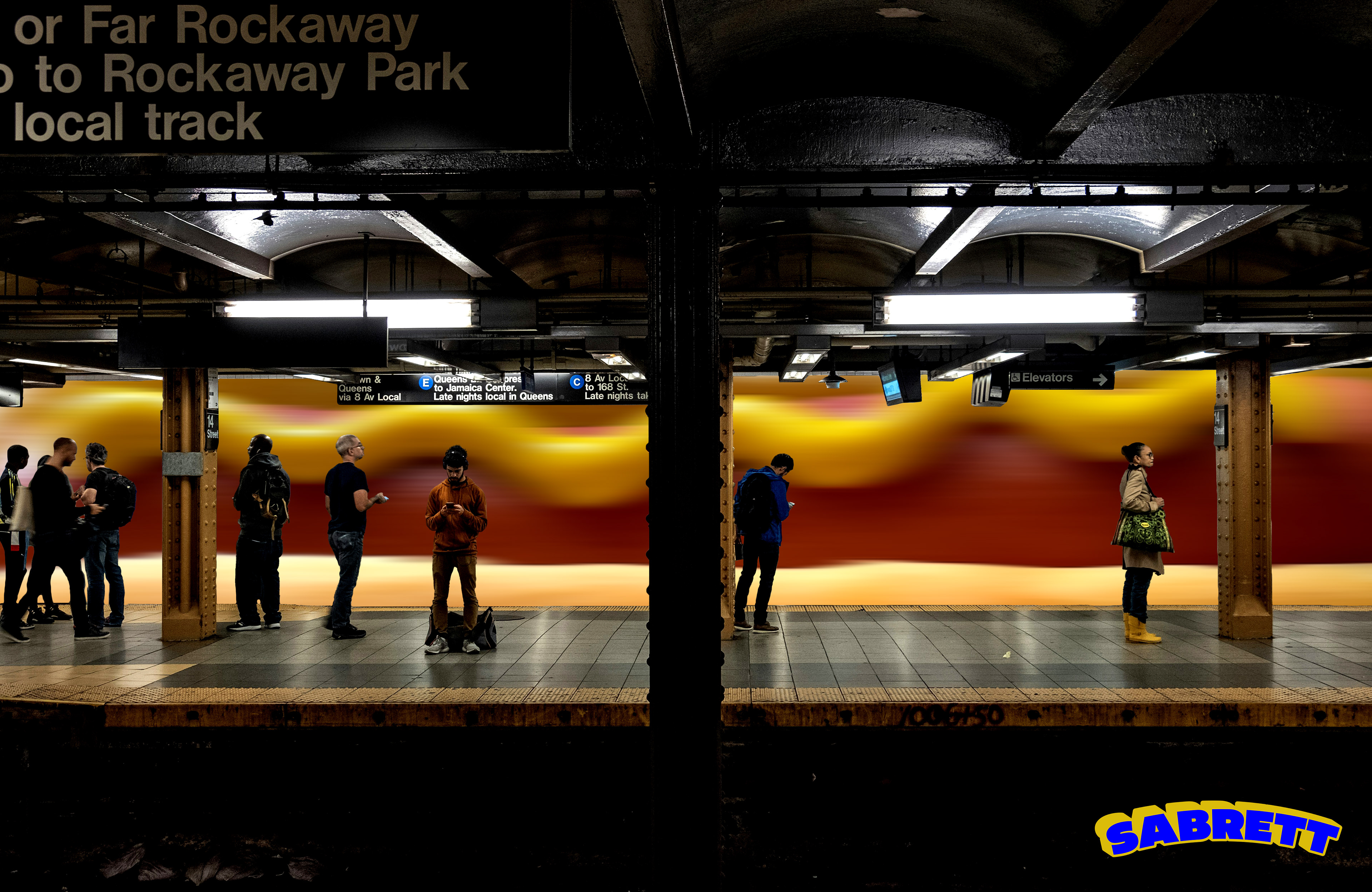
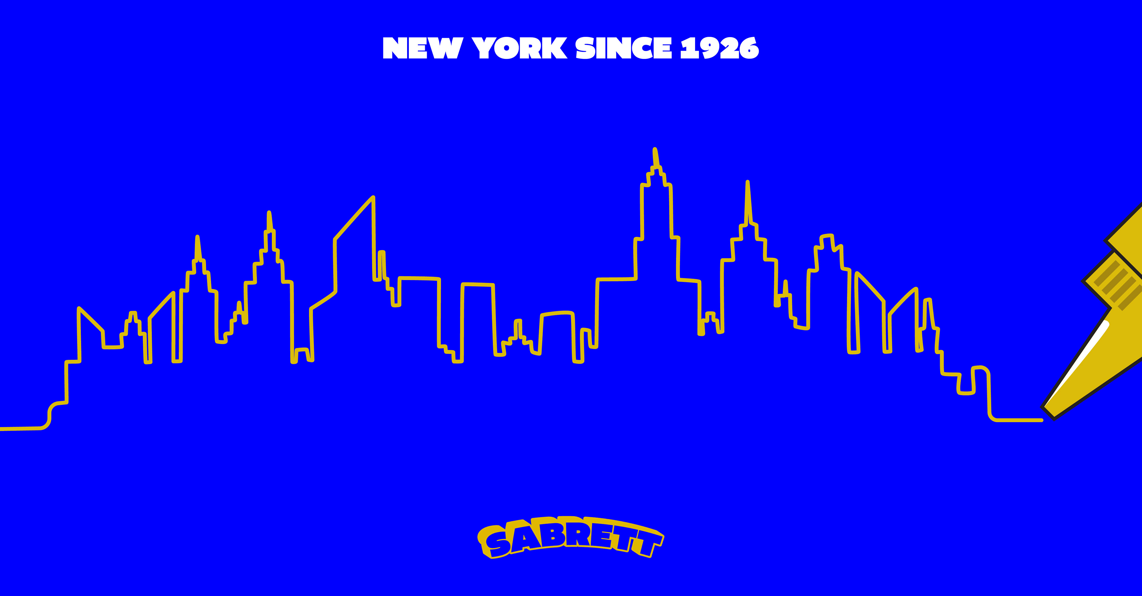
I then created additional graphics to help emphasize the carts place in New York City, a fun, colorful, and incredibly alive city.
I chose stronger hues for the yellow and blue that partner with each other smoothly. I chose the Atlive Ultra type and decided to stick with an all caps style as it helped display boldness of the brand. I also decided to keep the extrusion effect on the logo.
I went through many phases of the menu but decided to stick with a look that paralleled the vibes of a bodega which brought that classic hand painted text look to the menu. I also felt like sticking with illustrations of the menu items as they felt fun and didn’t look as serious with images of the hot dogs. I also decided to add prices along the way to add depth to the menu (also hot dog carts never have prices on them).
I then created additional graphics to help emphasize the carts place in New York City, a fun, colorful, and incredibly alive city.
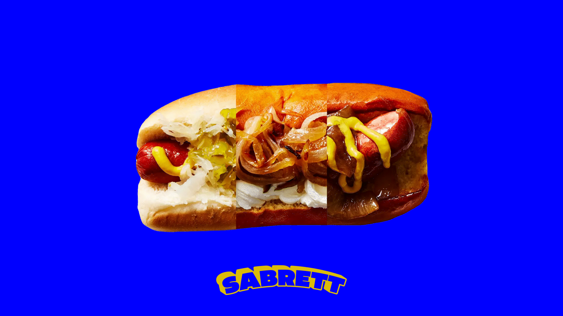
Solution
I redesigned a New York City hot dog with the intent of keeping all its soul and color so it doesn’t feel like a gentrification act.
I redesigned a New York City hot dog with the intent of keeping all its soul and color so it doesn’t feel like a gentrification act.
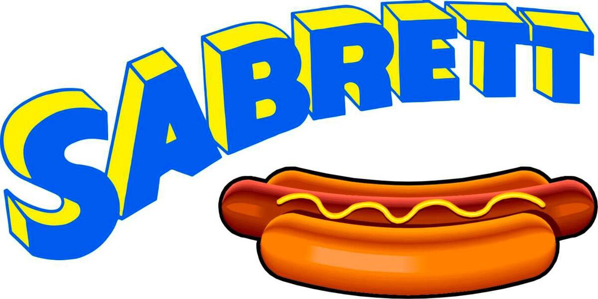
Current Logo
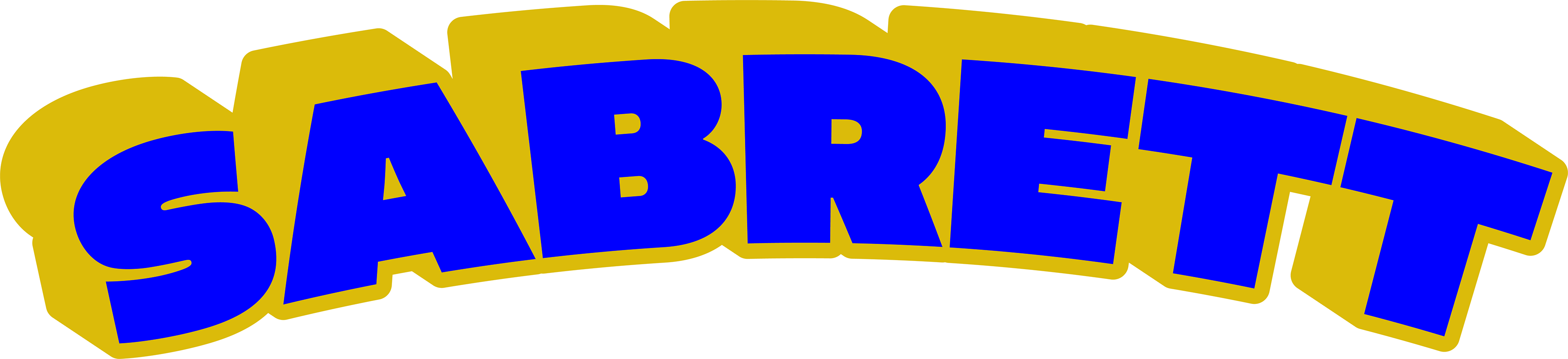
Proposed Logo
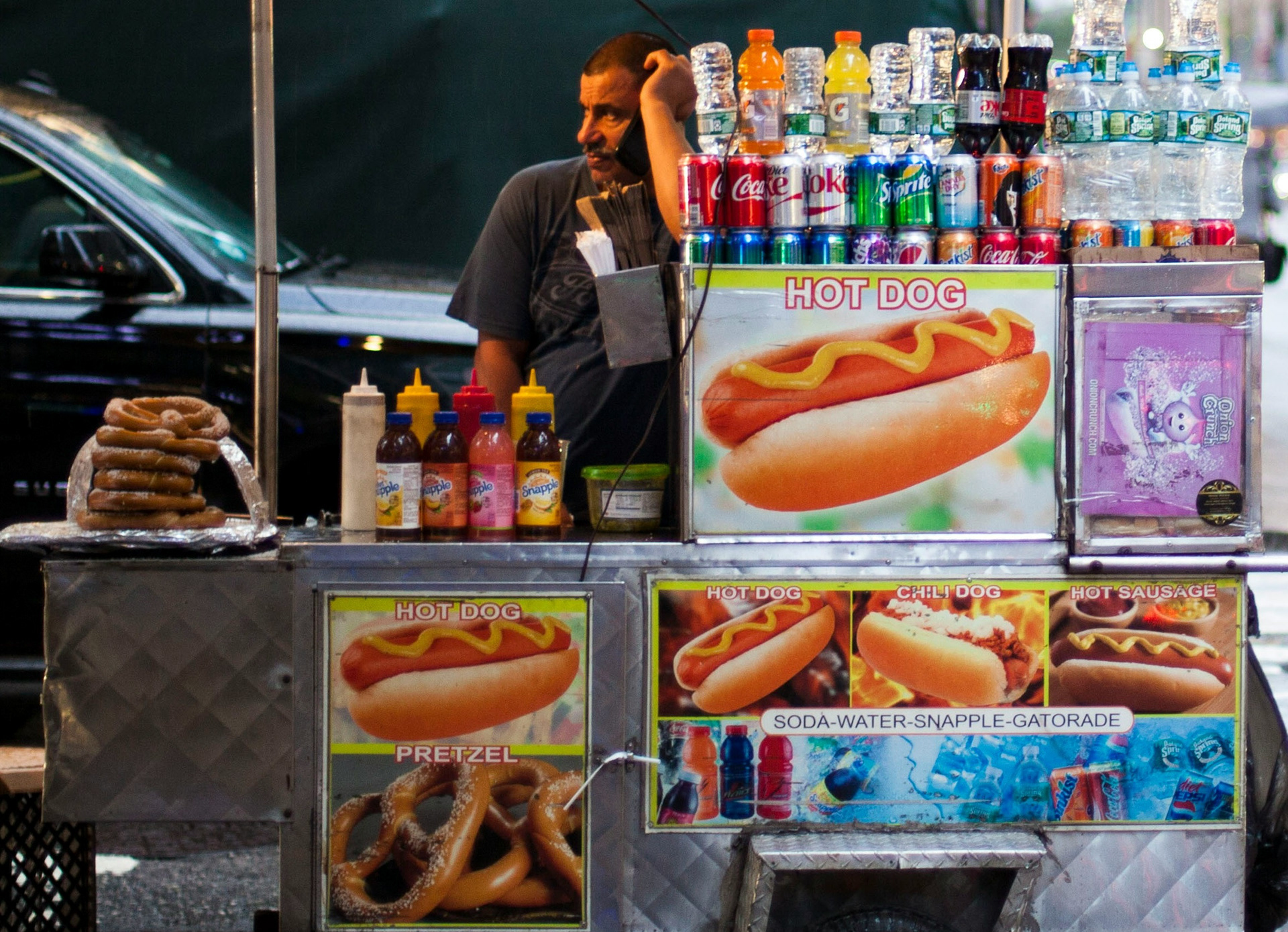
Current Cart
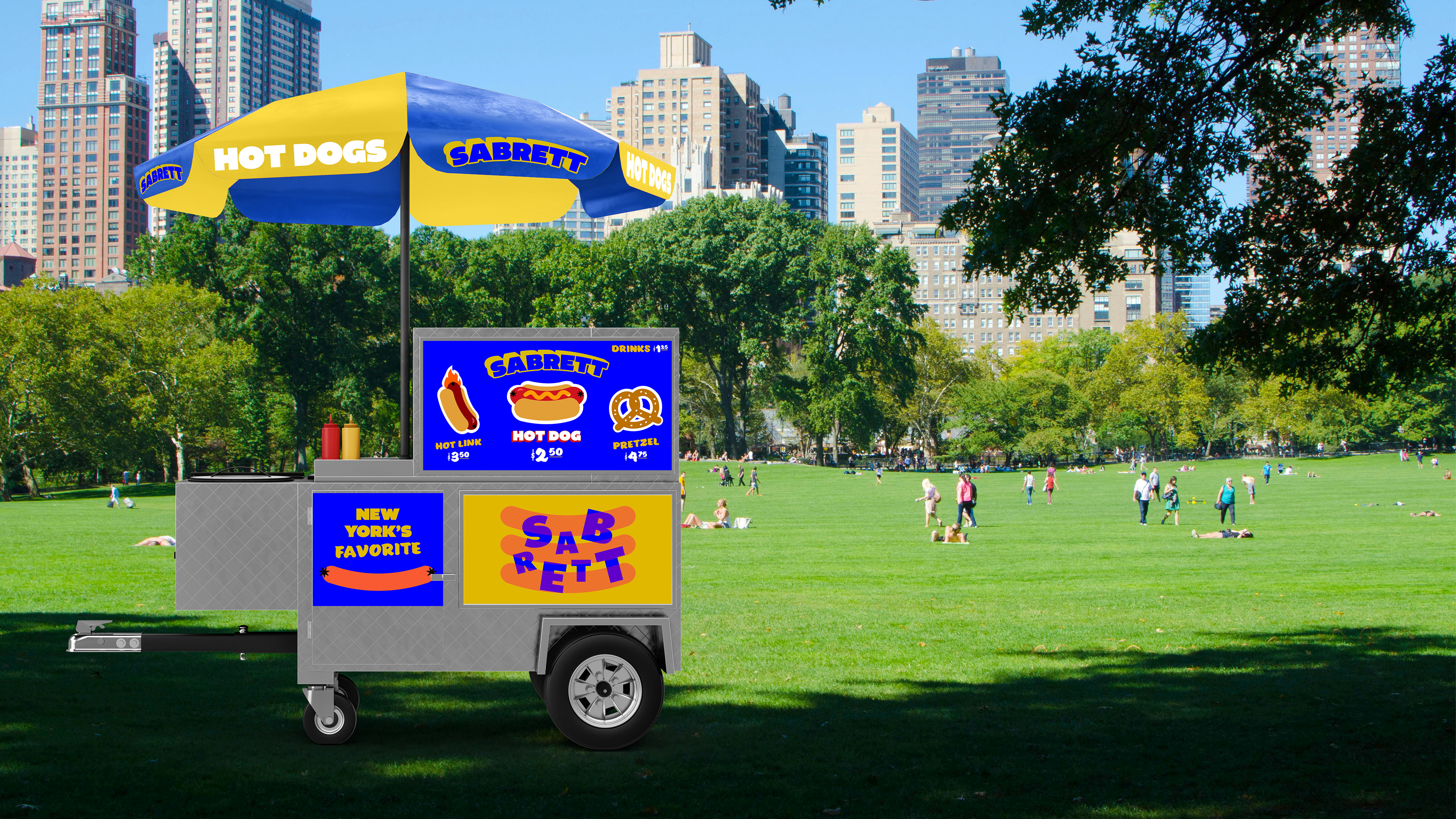
Proposed Design

*This site dithers my graphics